"Most brands ask what they look like. Neitha needed to figure out what it stood for first."
Brand DesignIdentityStrategy
Role
Brand Strategist & Visual Designer
Year
2025
Tools
Adobe Illustrator, Figma
Deliverable
Full brand identity system
Neitha Collective
My friend Lorna, Neitha's founder, came with a name and an instinct. I turned that into a brand identity system ready to trade: logo, colour, typography, and every application built for a brand about to launch.
The brief
A name and conviction. Nothing else.
Neitha came to me with an instinct: bold, expressive, something that felt personal. But no visual language to show for it. No logo, no colour direction, no identity system. That's actually the hardest kind of brief to receive. There's nothing to react to. Everything has to come from listening carefully and then making strong decisions.
The tension
Bold without tipping into noise.
The Kenyan fashion market has a sameness problem. Brands cluster around the same safe palettes and modes of expression. Neitha wasn't interested in settling. But bold fashion brands often tip into either aggressive maximalism or studied minimalism. The challenge was finding the space between: a clear point of view that didn't pin the brand to a single mood. Importantly, give people a chance to find clothes they want to wear, not just a brand they wanted to follow.
The work
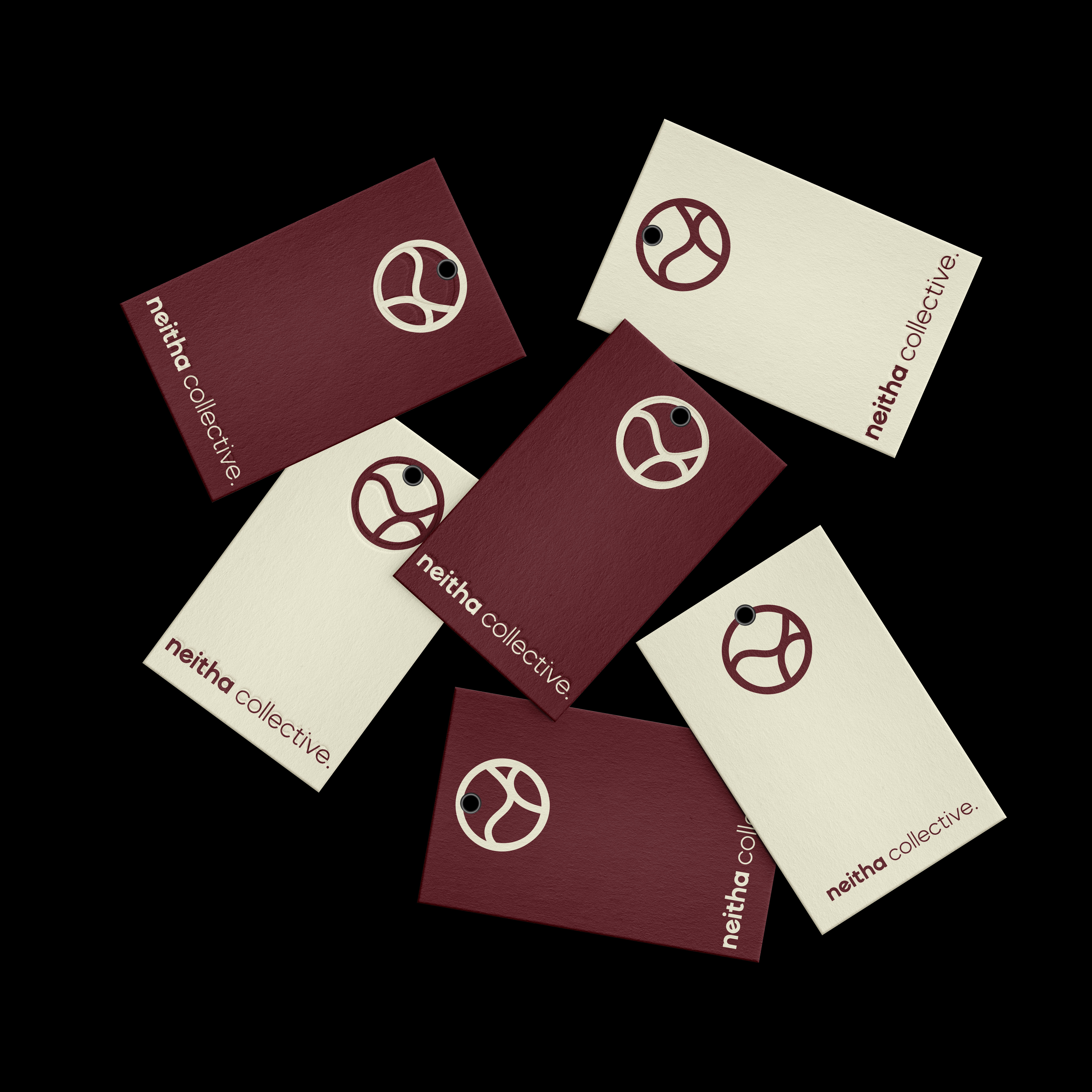
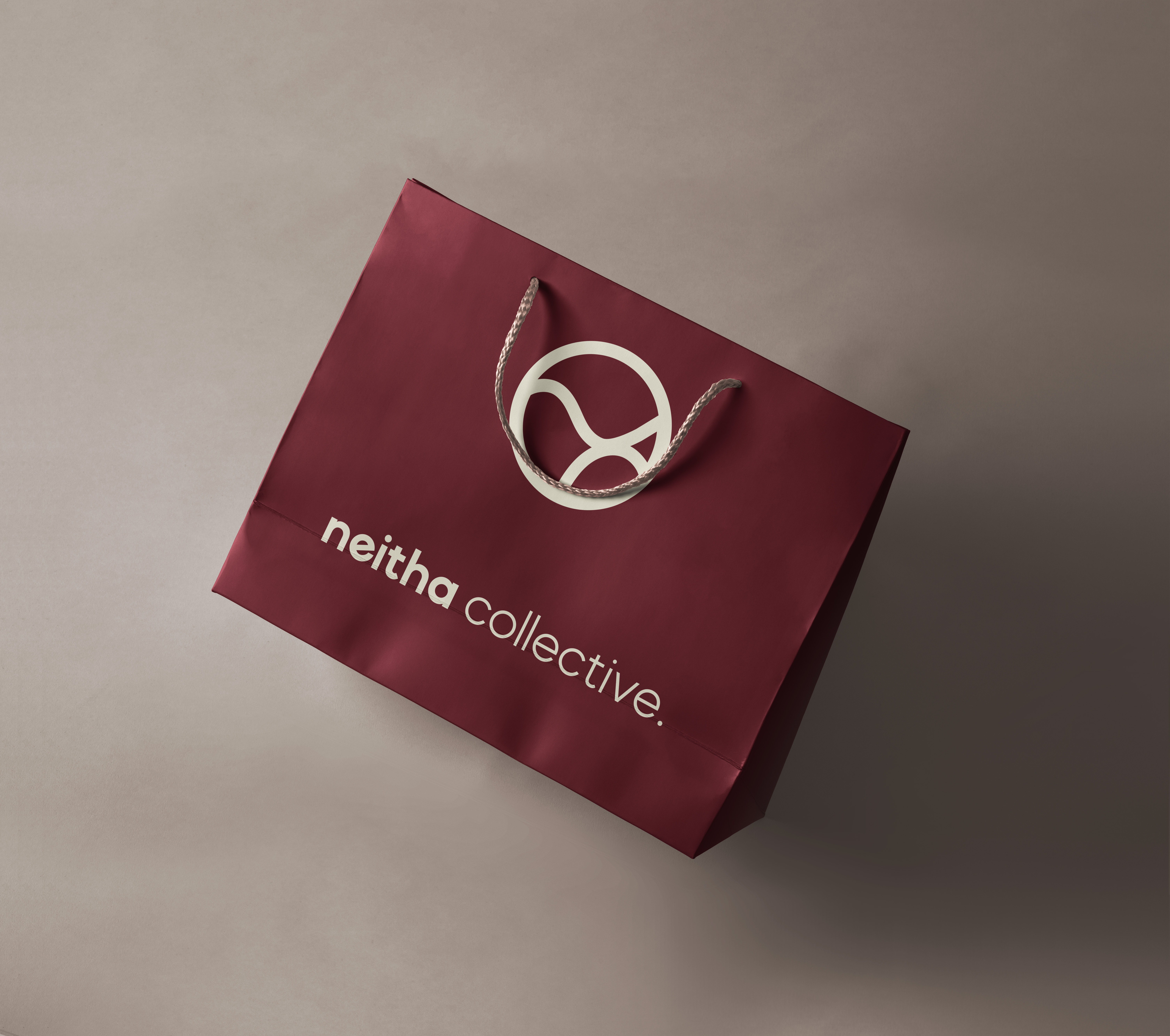
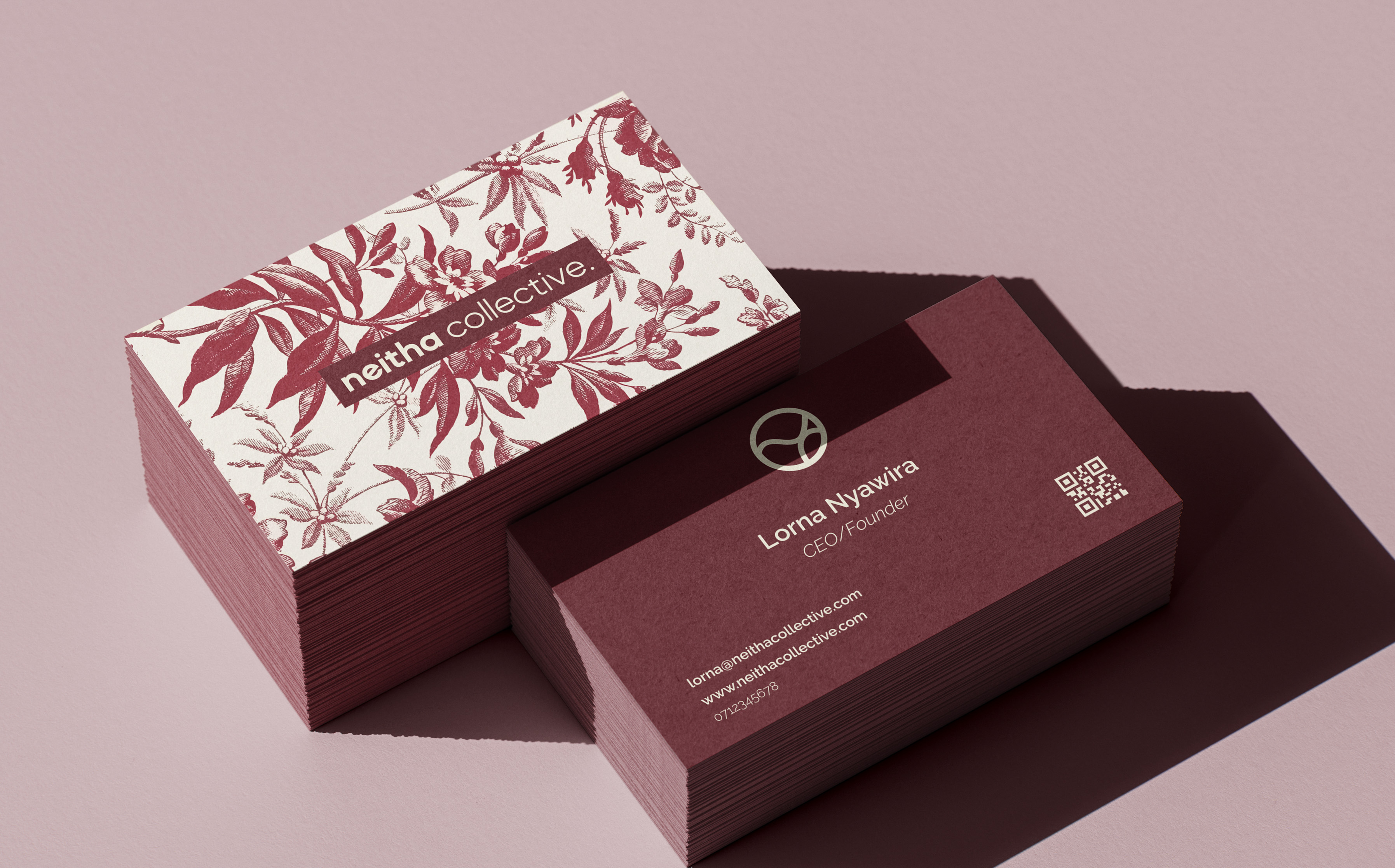
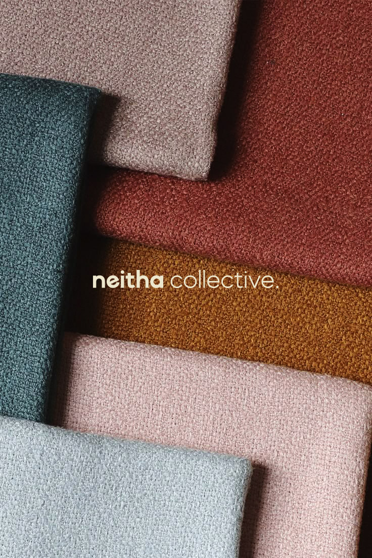
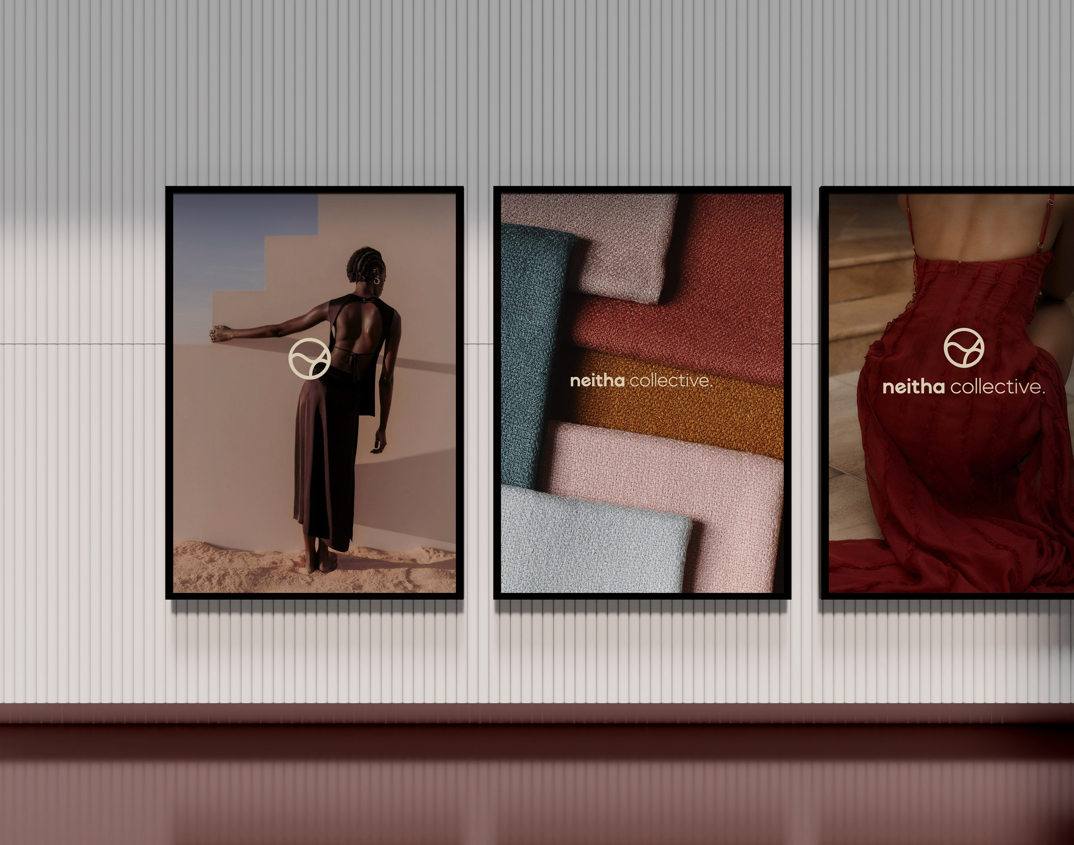
A complete identity system. Not a concept. Every asset ready from day one: primary mark, alternate logotypes, colour palette, hang tags, shopping bags, business cards.
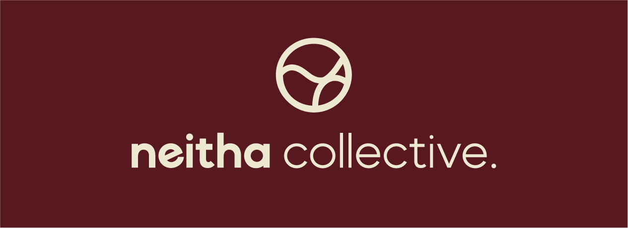

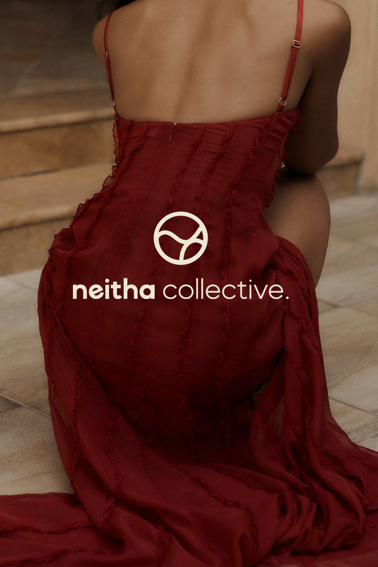
The mark
Neither this nor that.
The final logo references both the N and C, functioning like a yin and yang. It carries the idea embedded in the name itself: fluid, unrestricted, neither one thing nor another. The circular composition speaks to community and unity without rigidity. It works as a wordmark, a standalone icon, and everything in between.
Art direction
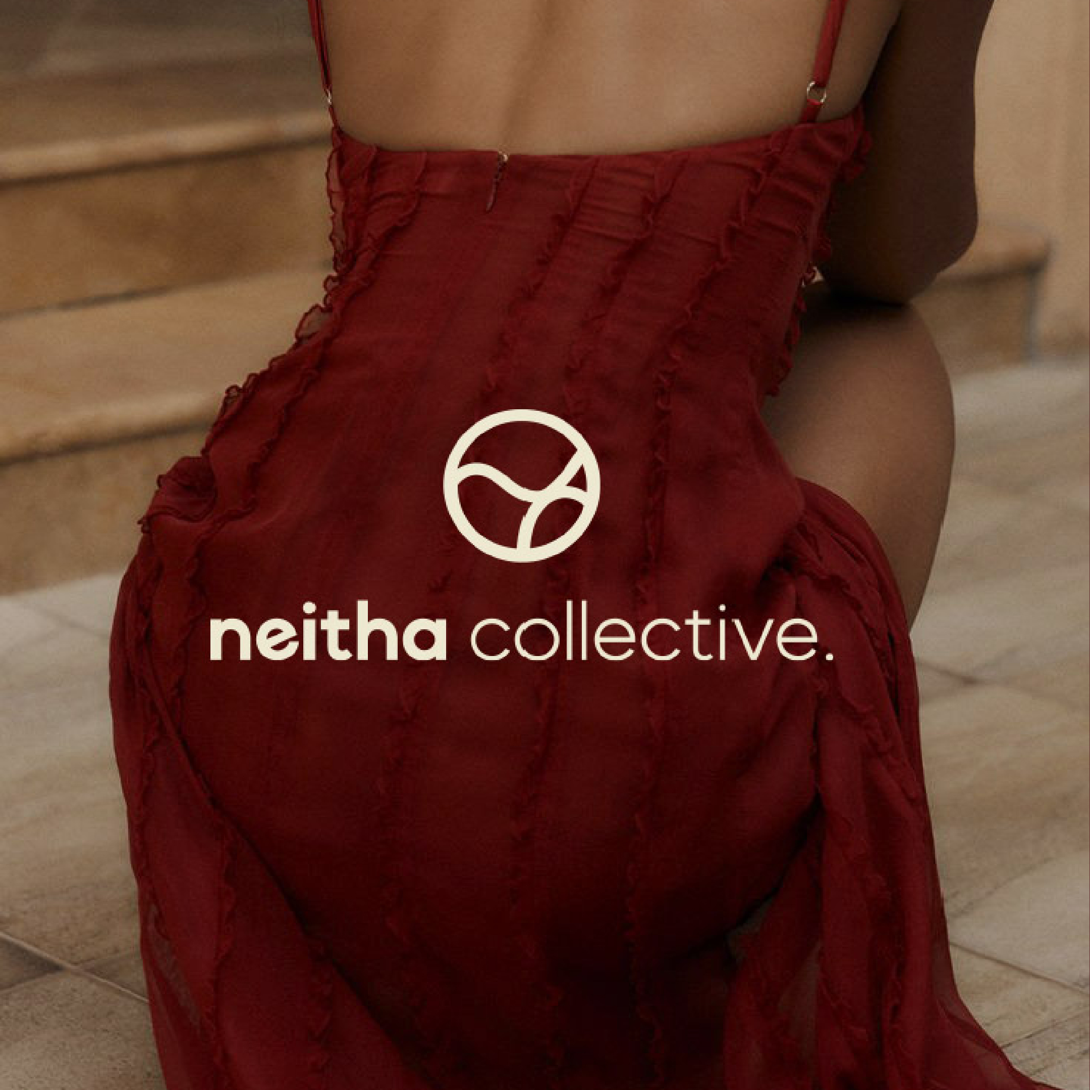
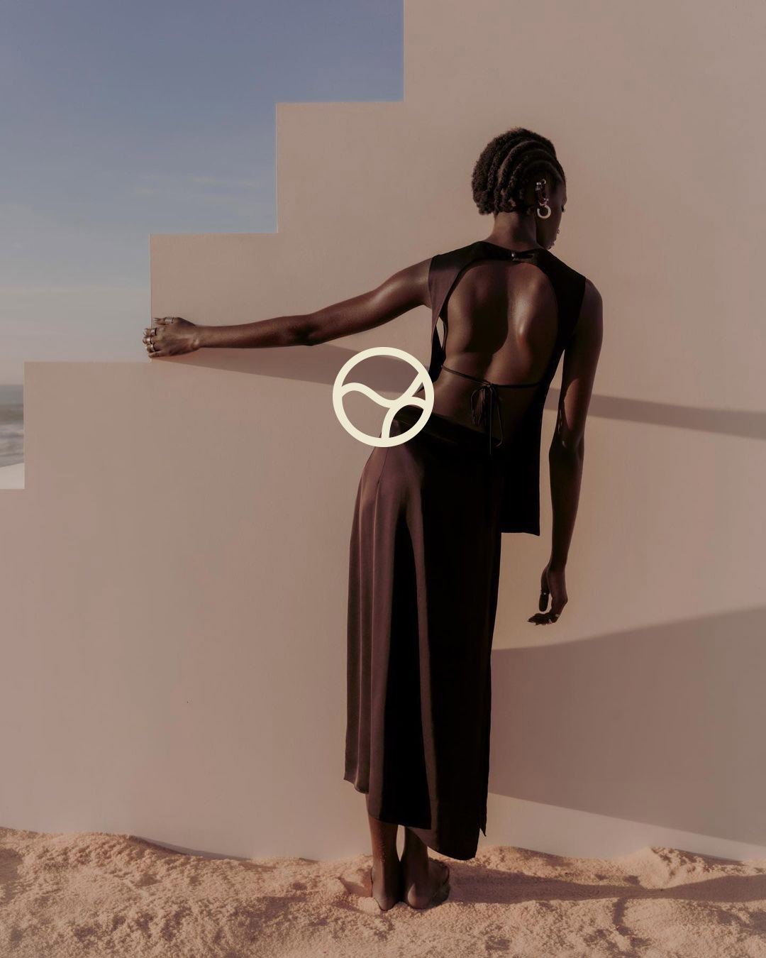
The visual language extended beyond the mark — into textures, compositions, and the feeling a brand creates before a product is even visible. The idea, to give the brand a dyanamic view while still being rooted in the mark's core idea of fluidity and duality.

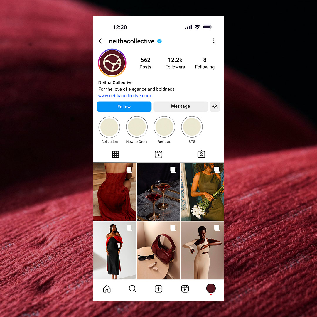
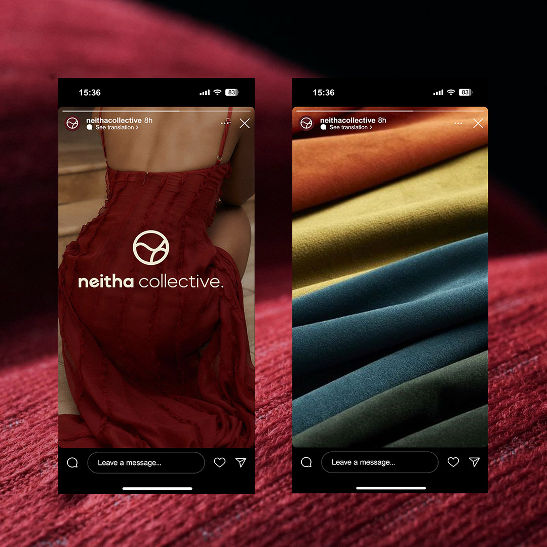
In the world
The identity in use across social: consistent, immediately recognisable, holding up exactly as designed.
What this taught me
When a client brings you a name and a feeling, the brief is everywhere: in how they talk about their customers, in what frustrates them about other brands, in the offhand things they say aren't quite right. A brand identity isn't done when the logo is approved. It's done when it's in the world and holding. A year on, Neitha's assets are consistently in use across her Instagram storefront, product photography, and packaging in the wild. This one is holding. If you're looking for custom wear, please check out @neithacollective on Instagram. Completely worth it.