Role
UX Designer & Product Thinker
Year
2024
Tools
Figma
Deliverable
High-fidelity UI mockup
MALI
A financial education platform for young Kenyans who want to make better money decisions, and find every existing resource too Western, too advanced, or built for someone else entirely.
The brief
A gap that was personal.
I've watched people my age: smart, digitally fluent, earning. They avoid thinking about money because every resource they encounter either talks down to them or assumes a financial reality built somewhere in North America. The tools exist. They just weren't made for a young Kenyan trying to figure out what an MMF is, whether they should have an emergency fund first, or what the NSE is even for. That gap was personal and it was real.
The tension
Credible enough to trust. Approachable enough to use.
Finance content has a trust problem. Make it too casual and it feels unreliable. Make it too formal and it feels alienating. MALI had to thread that needle. That tension shaped every decision, from how the information architecture is organised to what the visual direction communicates before a single word is read.
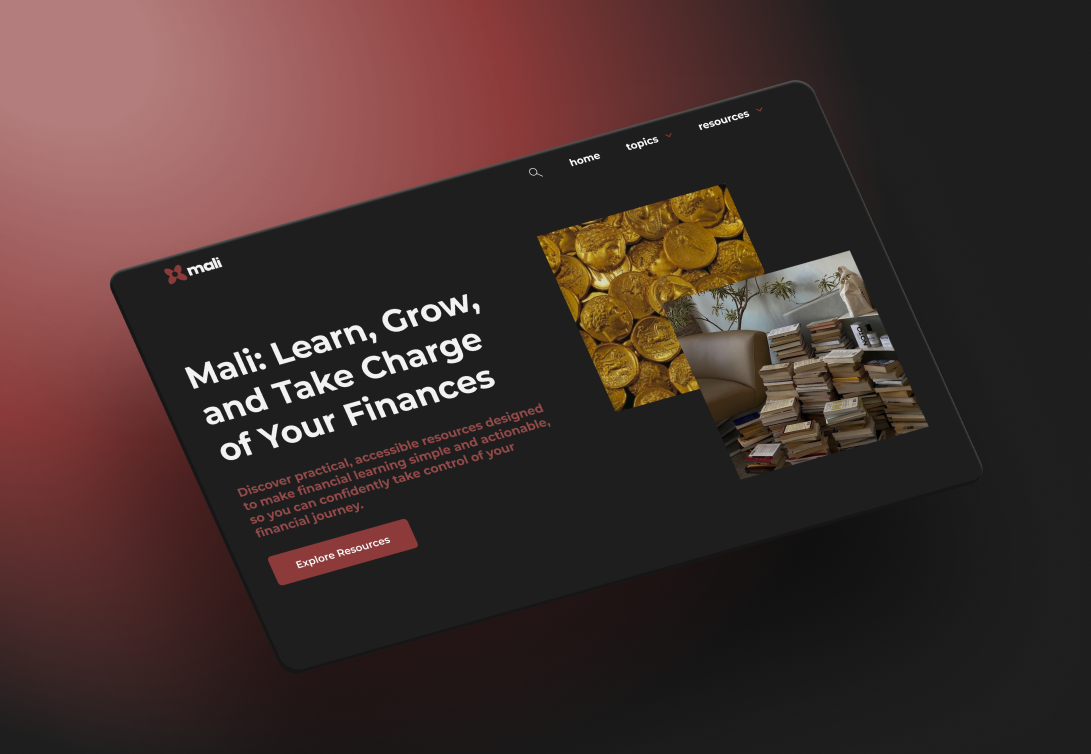
The look
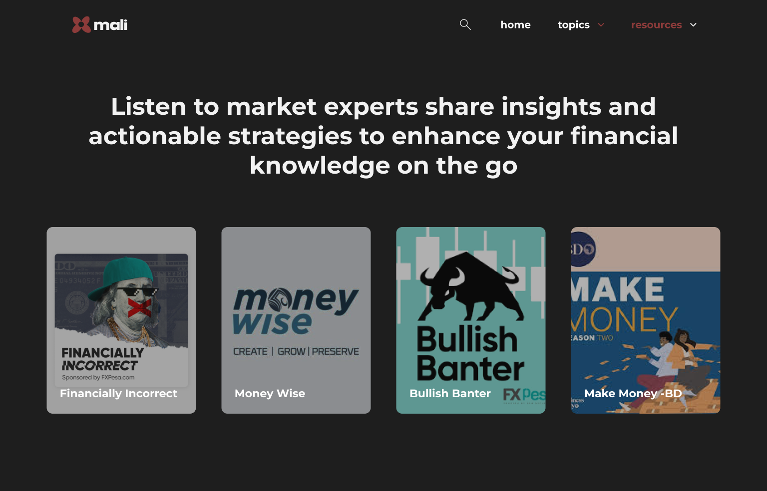
Dark and editorial. Intentionally.
Most personal finance platforms default to clean whites and reassuring blues. MALI pushes against that. The dark editorial aesthetic treats financial education as something serious and worth engaging with. Without the cold, institutional feel that makes most finance products feel like they weren't made for you. It signals: this is for someone who actually wants to learn, not someone who needs to be managed.
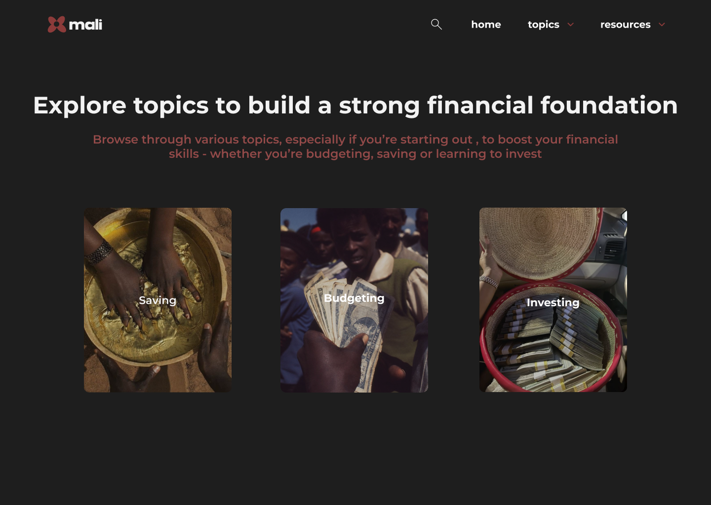
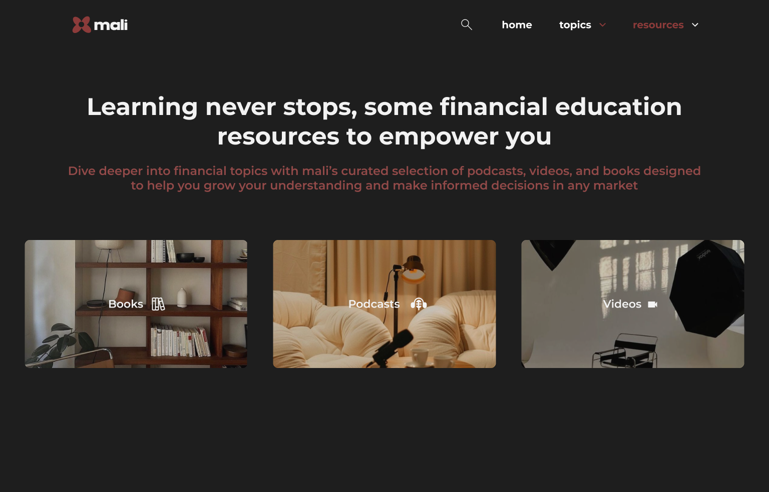
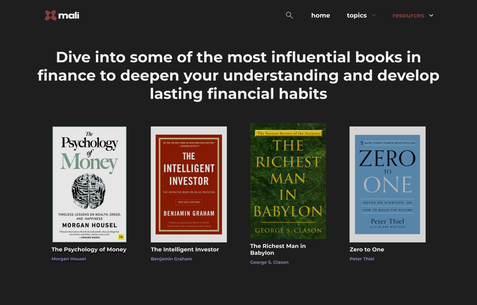
The work
High-fidelity UI mockup covering the core experience: homepage, topic navigation, and article layout.


What I'd do next
I would publish the site and prioritize user testing with actual first-time learners, not assumptions about them. And a closer look at what happens after someone reads their first article: does the platform give them somewhere to go next, or does the journey just stop? MALI is a first pass. But first passes that ask the right questions are worth shipping. Ultimately, I worked on this project back in 2024, and I would definitely consider re-designing it in a way that's more informed by how people actually used it. The core tension would probably still be the same. But the way that tension manifests in the design might look very different after seeing how real users interact with it.